Design System for Mintra
- UX
- Graphic Design
Role: UX-Designer
Type: Assignment at Noroff
Tools: Figma, Adobe Creative Suite
Date: Jan 2023
A weekly assignment where I created a design system for Mintra, an existing website by Mats Fjeldstad (a developer student at Noroff).
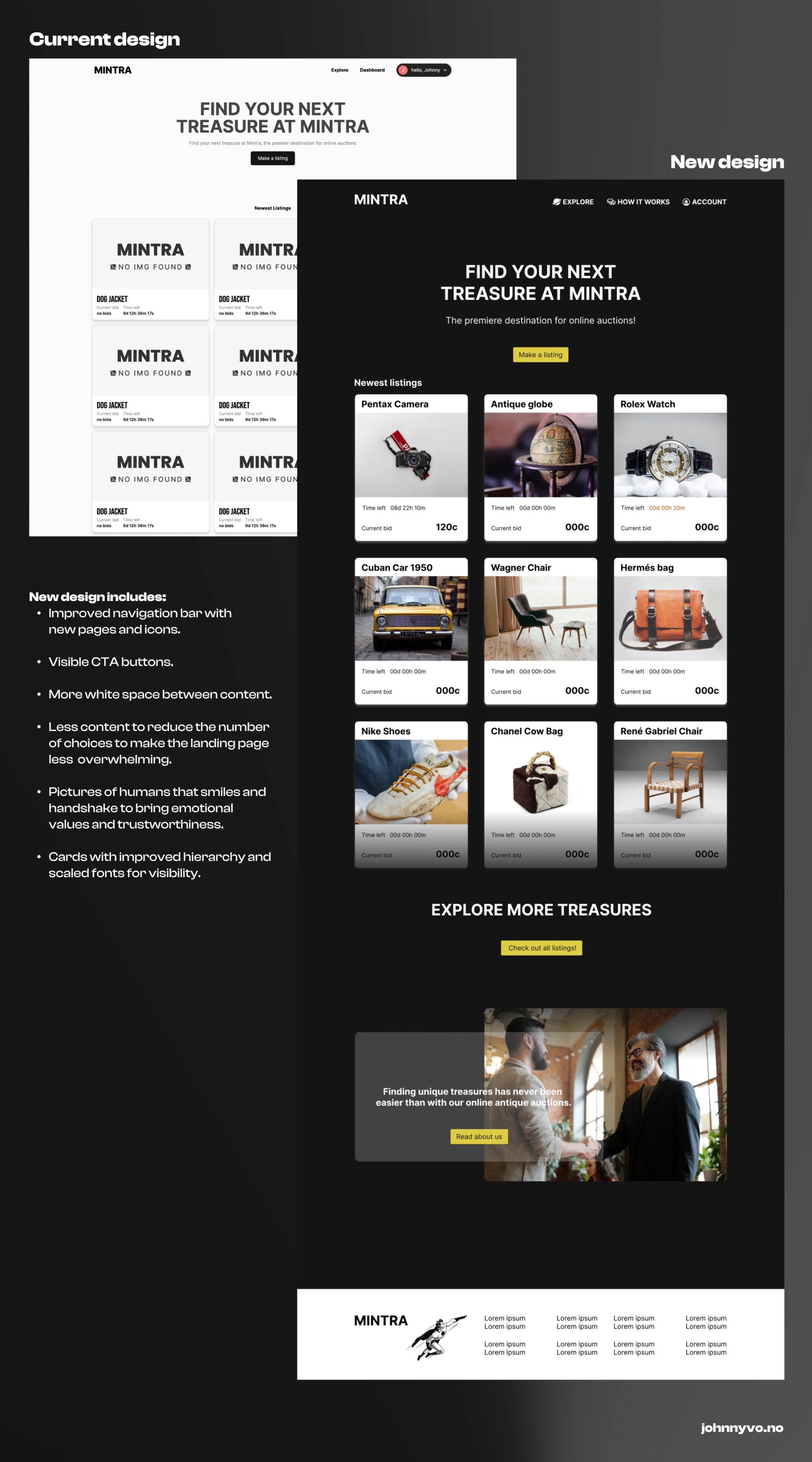
The task was to improve the website with a strong focus on UX design. Mintra already had a clear identity that is modern and simple. However, it lacked consistency and best practices for web design.

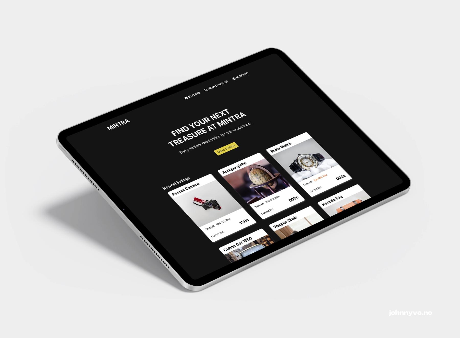
By analyzing the existing website I identified points of improvement to create a better user experience and the overall impression of Mintra. With smaller and bigger adjustments such as reversing the use of color, putting the elements in systems and grids, and improving the hierarchy of the content, I was able to form a clearer framework that makes it easier for the user to navigate.
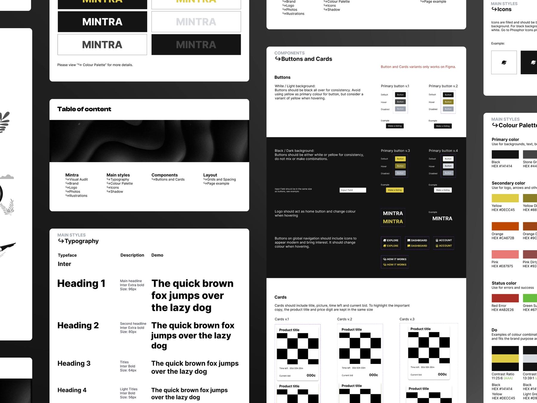
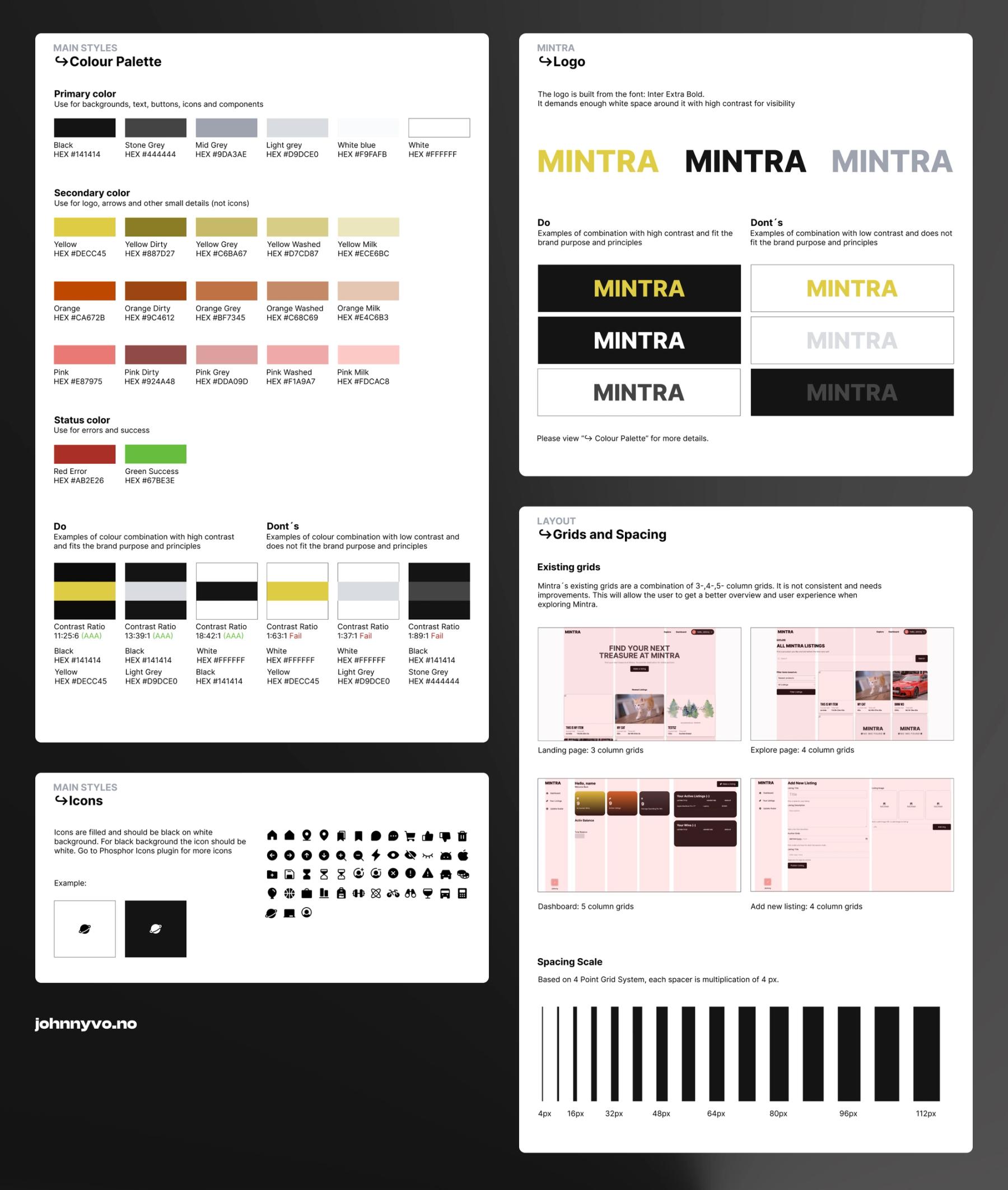
The design system includes:
Typography, buttons in different states, a larger color palette, illustrations, images, icons, use of shadows, grids recommendations, and much more. If you have Figma, take a look here.

What I have learned:
Due to the time constraints of this short assignment, I did not have the opportunity to test my Design system with Mats to get valuable feedback for adjustments and iterations. However, to enhance the scalability of this Design system, I recognize the importance of incorporating additional details regarding the implementation of light and dark-mode elements.
