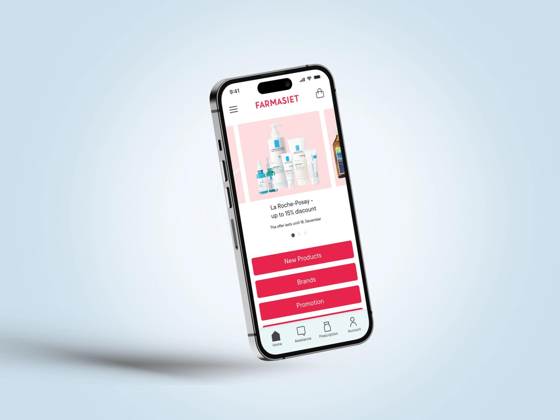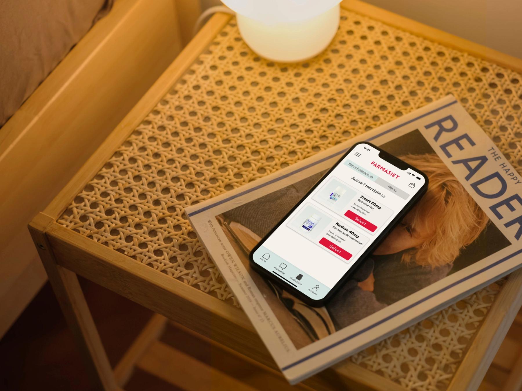
Farmasiet app
- UX
Role: UX-Designer (In collaboration with Sierra Taylor and Øyvind Kaasa)
Type: Case Study, Semester Assignment at Noroff, Winter 2022
Tools: Figma, Figjam, Airtable, Adobe Creative Suite
Date: Nov-Dec 2022
Case Study for Farmasiet with Shortcut on Norwegian consumers and their habits of ordering prescription medicine online.
Background:
Farmasiet is Norway's largest online pharmacy and has had great success with almost 600 000 new customers in the last three years. However, the pharmacy market in Norway is still not very digital and there´s a huge potential to increase the 3% of consumers who order prescriptions online.
Goal:
As UX designers, our goal was to create an initial proposal for the Farmasiet app and explore how it could transform people's pharmacy habits. To achieve this, we followed the Design Thinking Process, which involved empathizing with users, defining their needs, generating ideas, creating prototypes, and conducting tests.
Process:
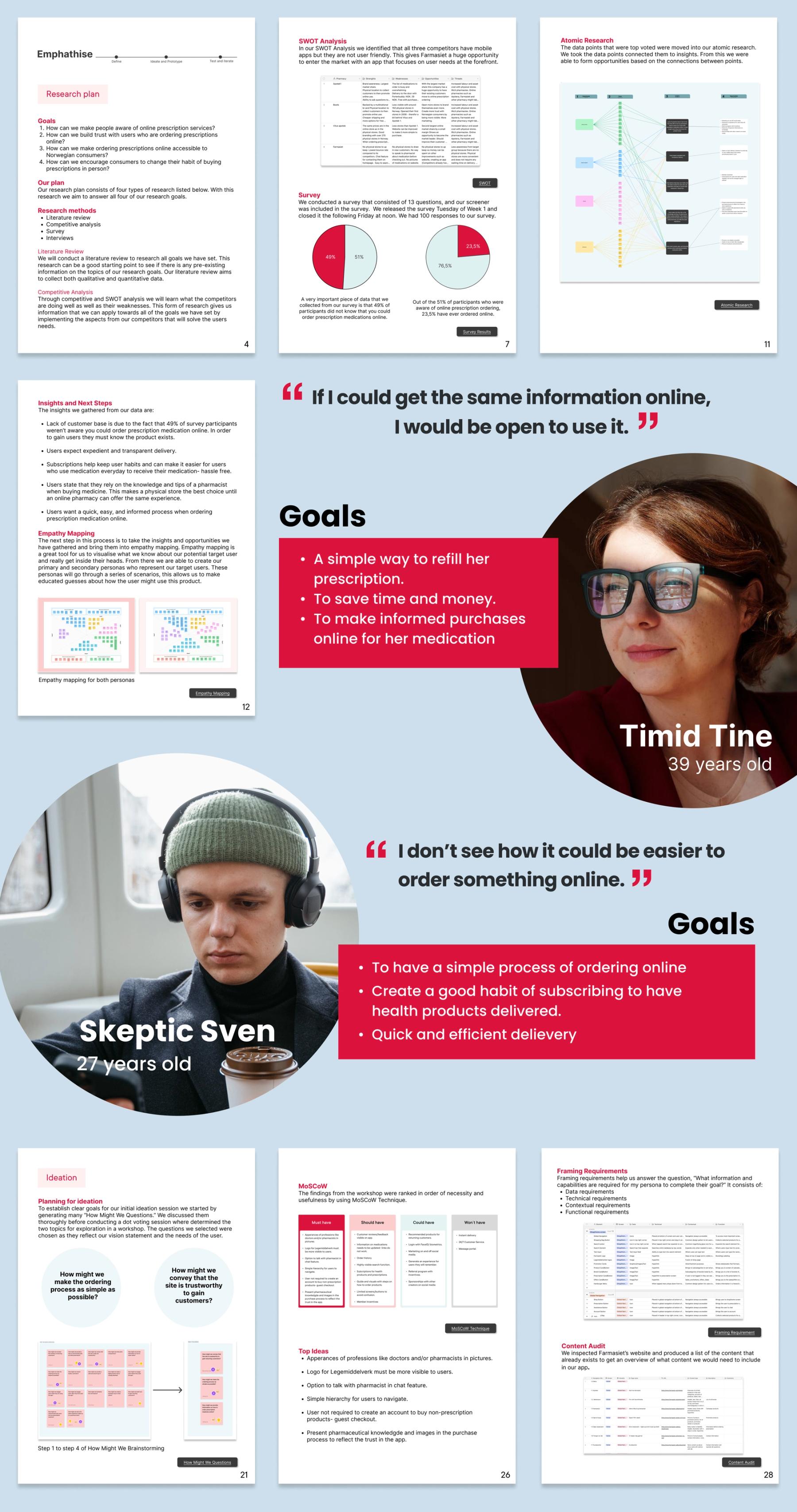
In the first two weeks, we conducted research, survey, and interviews to identify consumer habits and to emphatize with the target group. With the key findings, two personas were defined to match our users. We then created scenarios, user flows, and a problem statement before conducting ideation workshops to generate ideas and features for the app's interface.
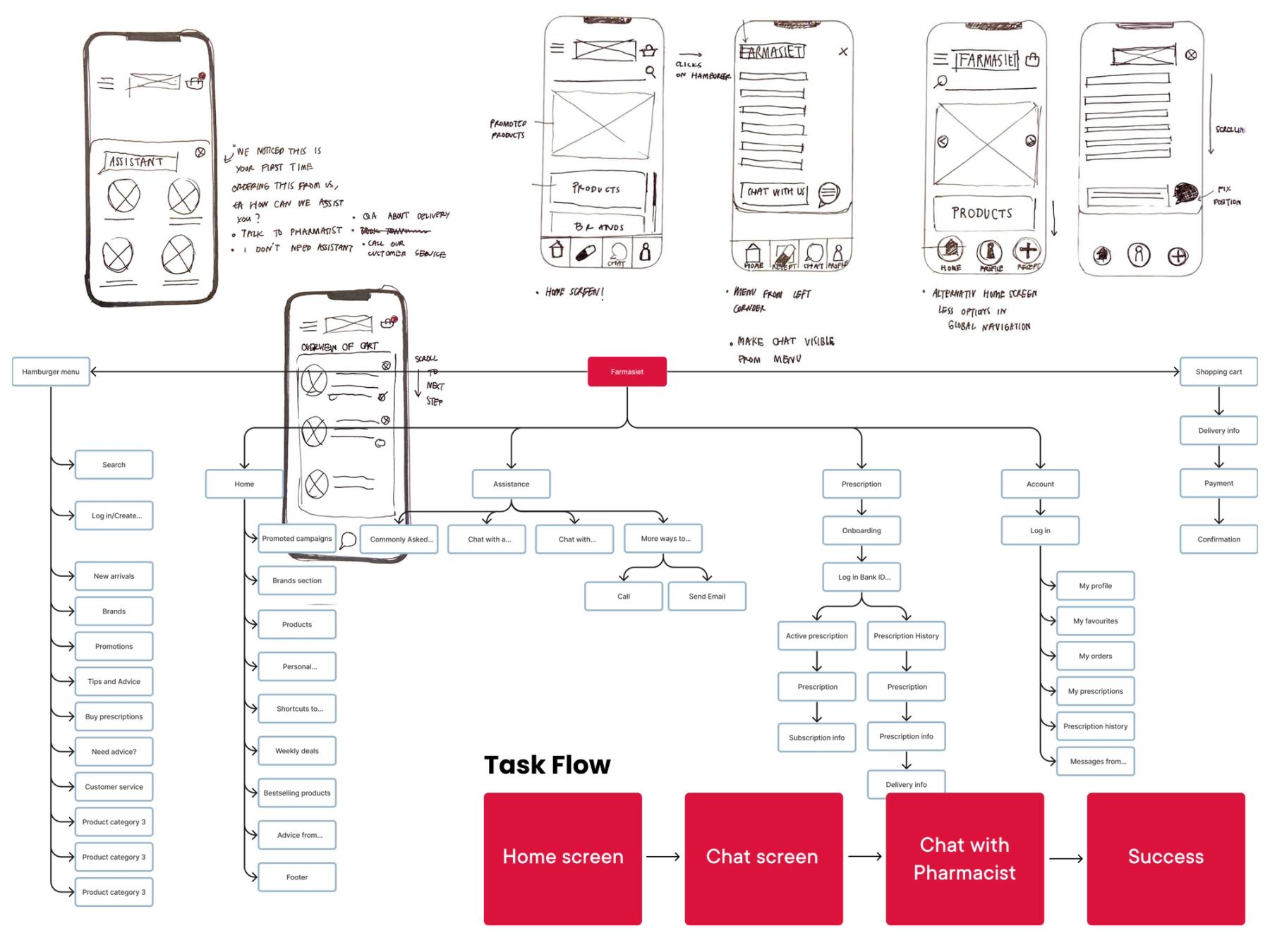
The last two weeks we spent sketching and prototyping in Protopie for usability testing. We conducted the test with five participants that gave us qualitative data and valuable insights. On the last steps we made iterations on the product.
My role and contribution in the group assignment:
Throughout the entire duration of the group assignment, I actively participated in every stage, demonstrating my ability to take charge and ensure the project's smooth progress. With the responsibility of keeping our team aligned with our plans and daily tasks, I effectively maintained our focus and productivity.
I contributed with qualitateive research through interview and desktop findings, analysed the data using different techniques and created the UX and UI to focus on a better user experience. Before deadline, I collaborated closely with Sierra in creating the comprehensive report and presentation.
Result:
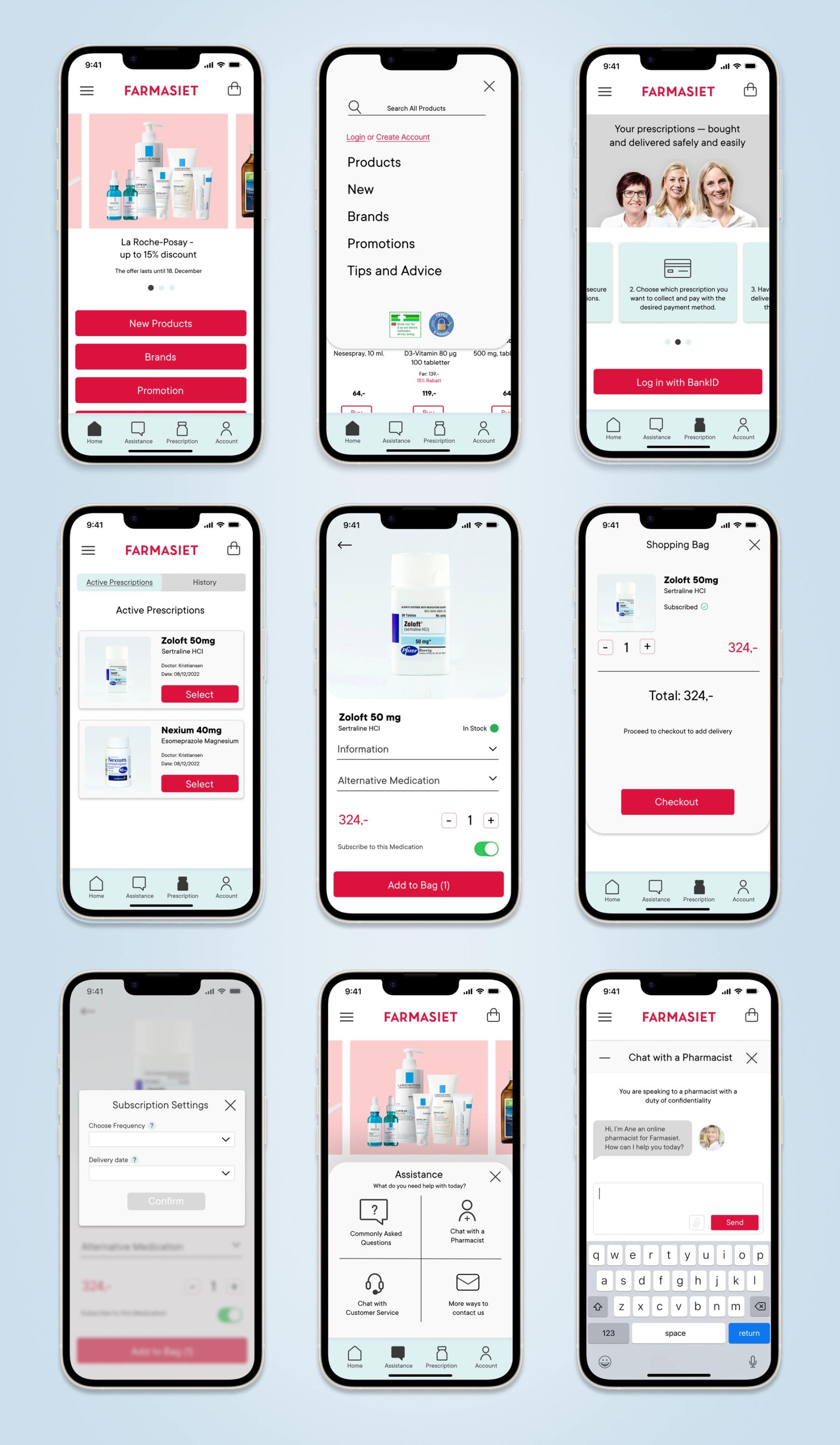
I am pleased to present the first draft of the Farmasiet app, which we developed within a four-week timeframe. We got positive feedback during the final presentation from our clients, Farmasiet and Shortcut. The app showcases a user-friendly design thhat meets the needs of its target audience.
It features:
1. Clear and simple UI, with a global navigation bar that includes important elements for users to locate their needs while using the app.
2. Good user experience that requires little effort and let user understand their next moves without unnecessary steps.
3. Various ways to communicate with Farmasiet by adding "Assistance" to help customers with ordering prescription medicine online, which is non-present today.
Click here to test out the Farmasiet app
What I have learned:
The outcomes of this assignment were incredibly valuable as it allowed me to practice collaborating with two other UX-designers. Working as a team of three designers can sometimes be challenging, but I found it to be fun and exciting. We each had different skills and knowledge, but we managed to combine them effectively and work well together.
