Loppa app
- UX
Role: UX-Designer
Type: Case Study, Semester Assignment at Noroff, Spring 2023
Tools: Figma, Figjam, Adobe Creative Suite, Airtable, Google Form
Date: April-May 2023
Case Study on Loppemarkets, enhancing collaboration and engagement between visitors and organisers in Oslo.
Background:
Today, visitors and organisers of loppemarkets face challenges in finding a unified platform for communication, information, and event sharing. Organisers spend significant time and effort to plan and organise loppemarkets, often relying on analog methods due to limited digitalisation.
Goal:
During my semester assignment, I dedicated my time researching and understanding the challenges and needs faced by both visitors and organisers in today's loppemarket scene. My goal was to develop a concept that would provide assistance and enhance the overall market experience.
Process:
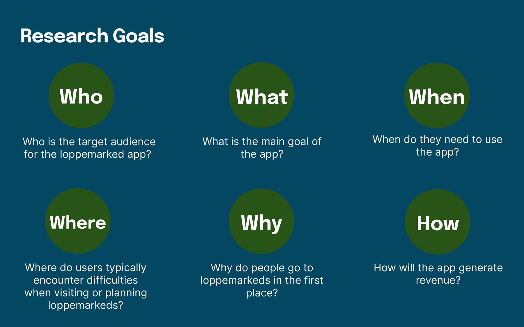
The idea of Loppa came from my personal interest and genuine curiosity about loppemarkets, prompting me to delve deeper into the intricacies of these events. Using the Design Thinking Process, I conducted primary and secondary research, and identified the challenges and requirements faced by both visitors and organisers.
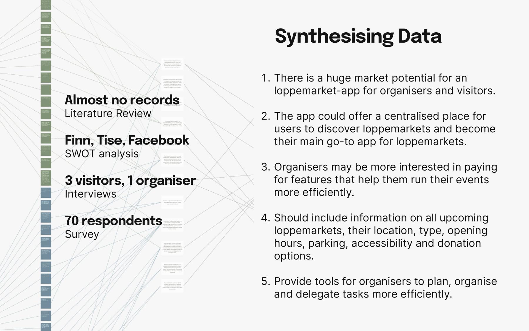

By synthesizing the collected data, I defined personas that represented the target group. These personas served as valuable tools for understanding user needs and motivations. To further guide the design process, I created user journeys, context scenarios, and key path scenarios, which helped generate ideas for ideation workshop and ensure a user-centered approach before sketching.
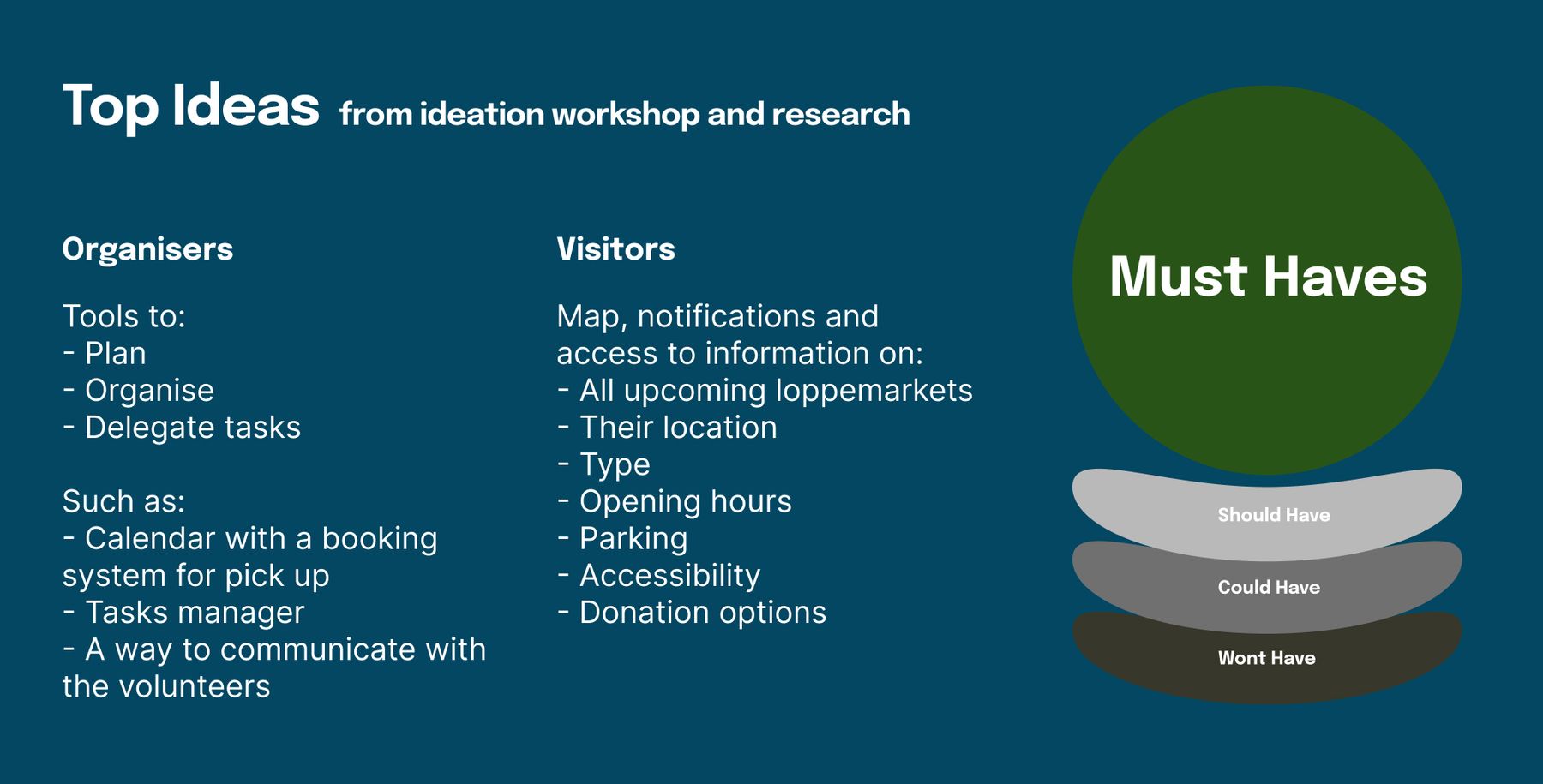
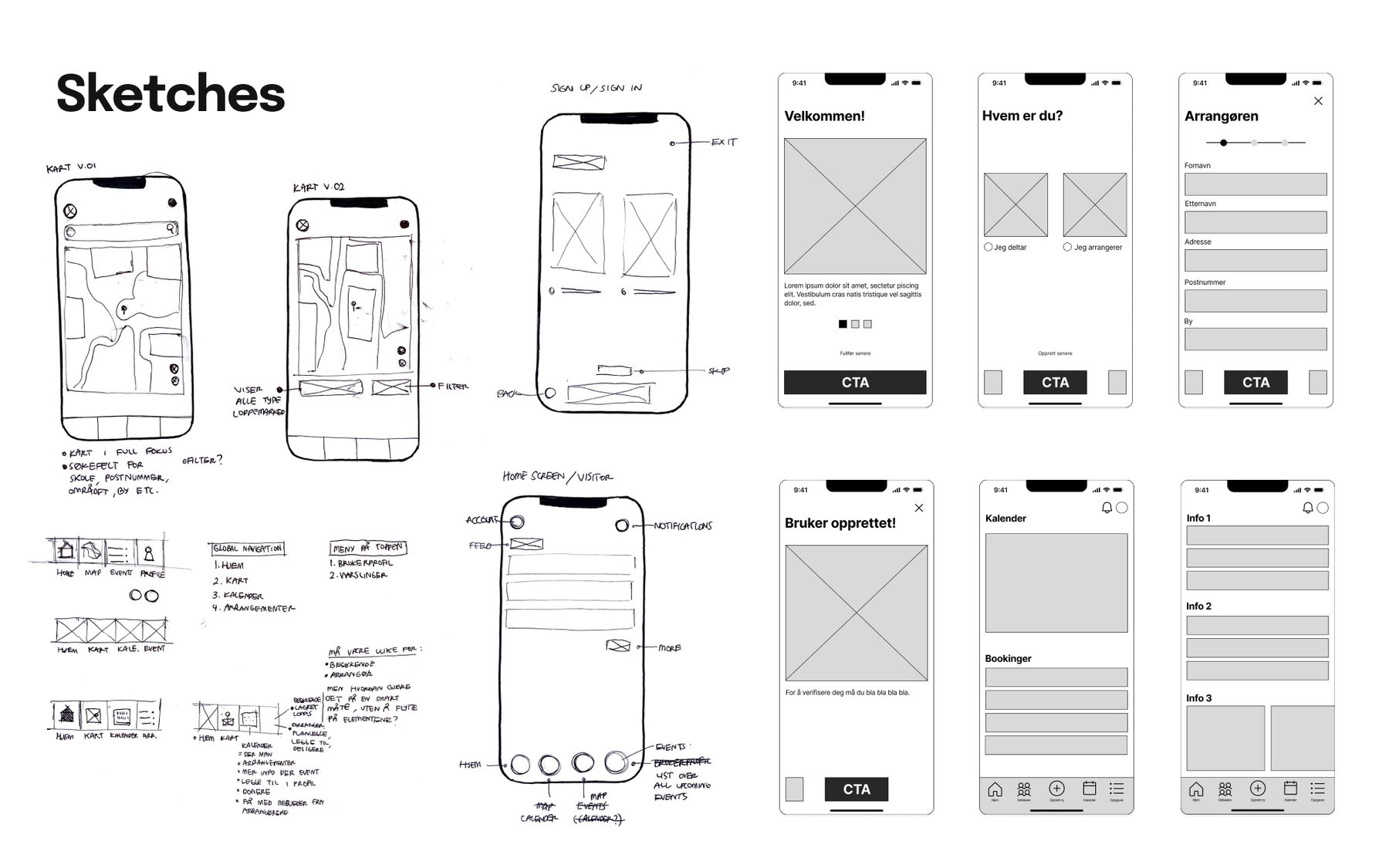
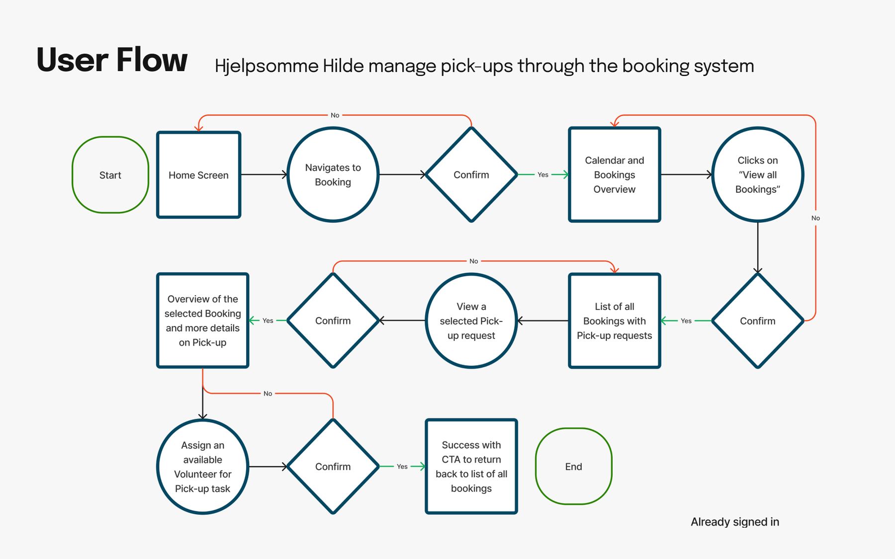
To ensure the design's validity and identify any usability concerns, I conducted usability testing sessions with three participants. Using Figma, I developed a high-fidelity prototype based on the user flows and wireflows I previously created. It was crucial to align the tasks in the testing with the needs and challenges of my personas, ensuring that the prototype reflected the intended concept. Test out the Prototype here!
The feedback from the tests provided valuable insights and key performance indicators (KPIs), which guided iterations and recommendations to improve the concept.
Result:
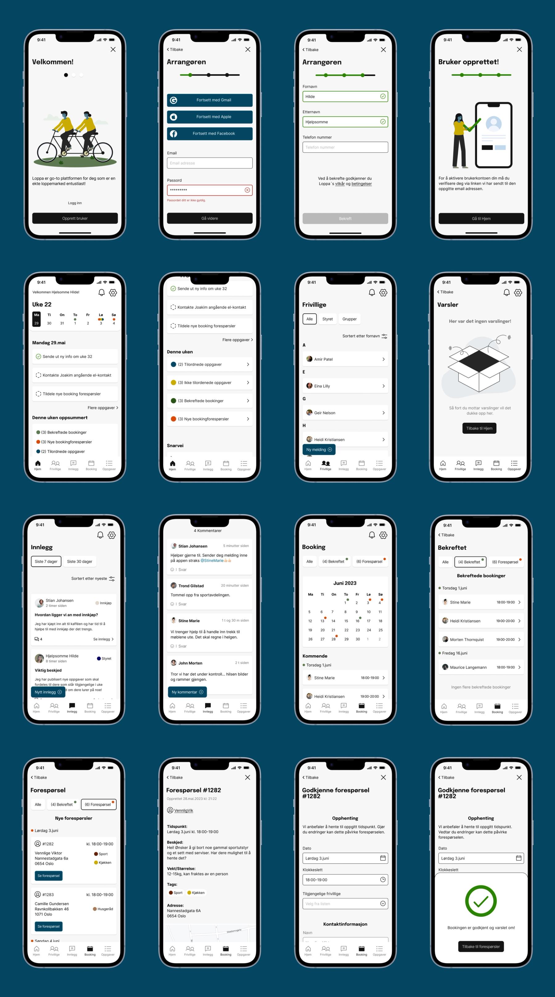
"Loppa, the go-to app for the loppemarkets enthustiasts". It provides a user-friendly interface and intuitive experience. Through effective use of color, element grouping, and clear hierarchy, the app ensures a seamless user journey. The revenue model revolves around organisers, who can create, plan, and share information with visitors, making it a valuable platform for both parties.
The app features:
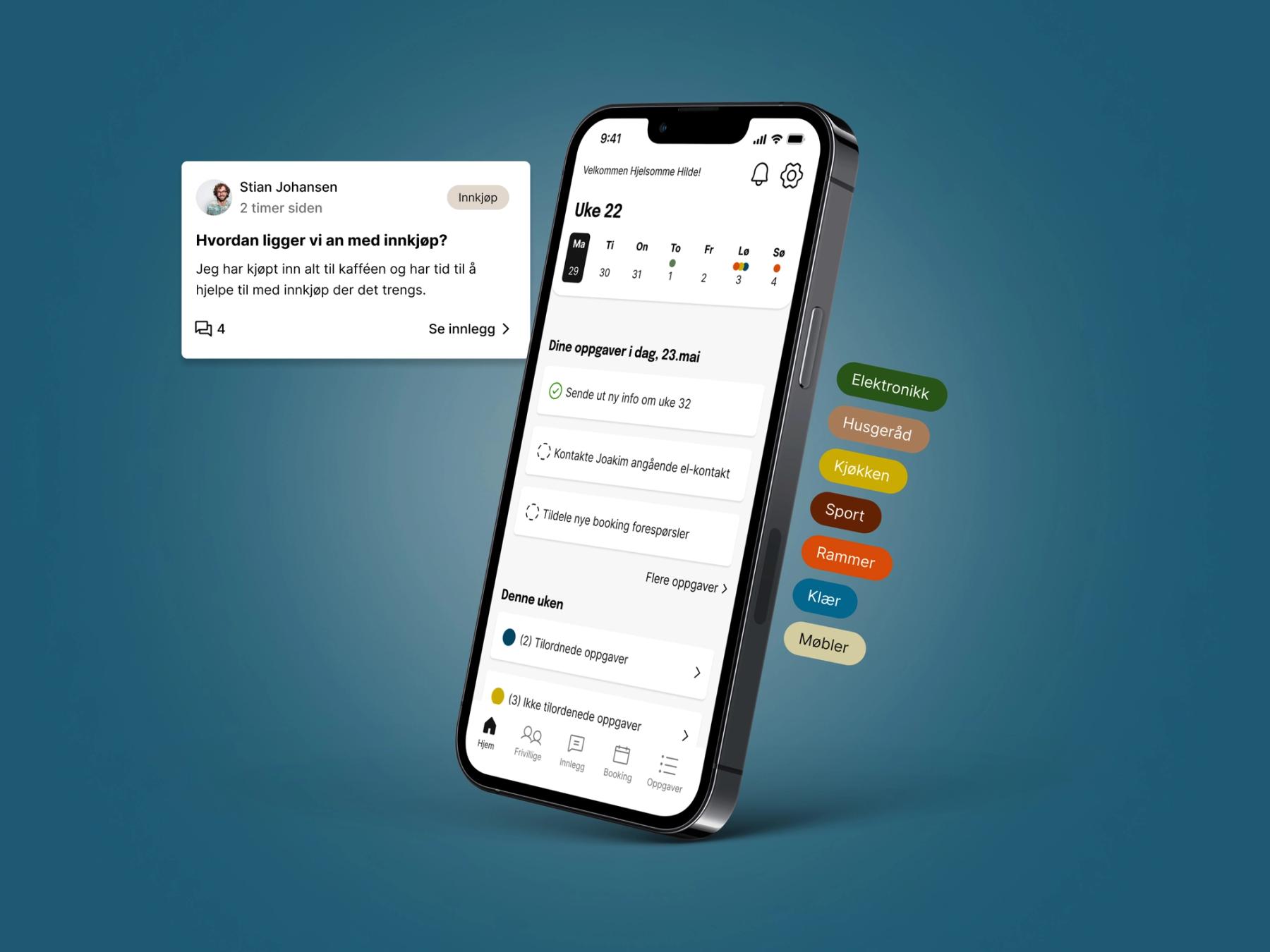
1. A platform to share information and communicate with organisers, volunteers and visitors, that can help attract more visitors, generate increased revenue, and reduce waste by emphasising sustainability.
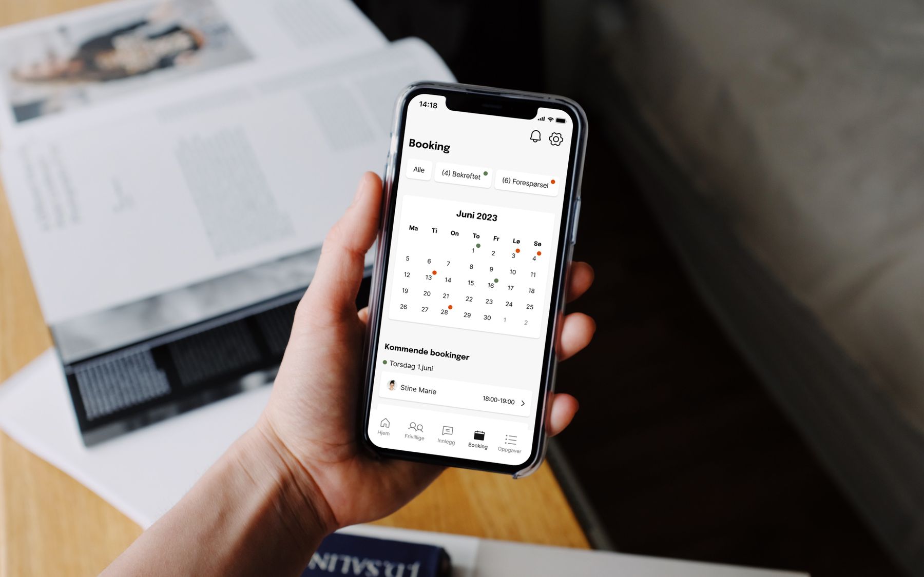
2. A booking system that allows organisers to accept, decline, or manage pick-up requests and assign them to available volunteers.
3. Tasks overview with full control on all tasks that needs to be assigned and completed before, during and after the events.
A report of 70 pages can be shared upon request.
What I have learned:
I am satisfied with the progress I made during the five-week period, although I consider this project ongoing as I have only completed the organiser's screen. The next step is to design the visitor's screen to fully showcase the entire concept. The market presents a huge potential for this app, and I would love to be a bigger part of it in the future. Furthermore, this experience has taught me a great deal about my abilities and working independently.
