Move U app
- UX
Role: UX-Designer
Type: Case Study, Assignment at Noroff
Tools: Figma, Maze, Adobe CC, Airtable
Date: Sept-Nov 2022
Case Study on Postnatal individuals that needs to improve physical and mental health after giving birth.
Background:
Research from Helsedirektoratet emphasizes the importance of staying active after giving birth to improve overall well-being. Unfortunately, there is a lack of information and support available for postnatal individuals, which makes it difficult for them to maintain a healthy lifestyle during this period.
Goal:
As a UX designer, the challenge was to create an app for postnatal individuals, offering vital knowledge and engaging experiences. Through this app, my aim is to empower and guide them in improving their physical and mental well-being after giving birth.
Process:
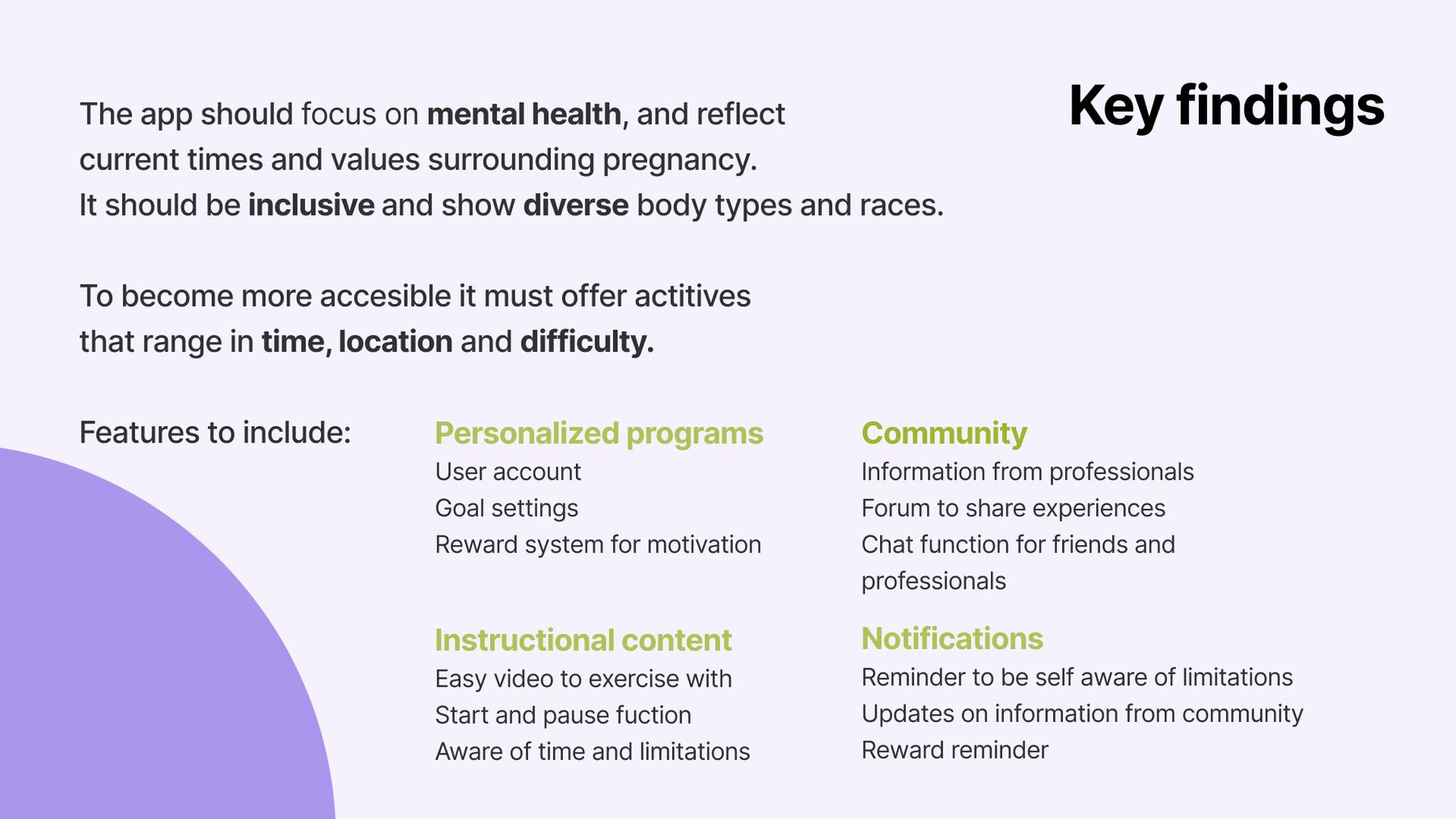
In the empathize stage of Design Thinking, I conducted research, surveys, and interviews to gather primary and secondary data. Analyzing these findings through affinity mapping and atomic research helped identify the problem and define the main target group.
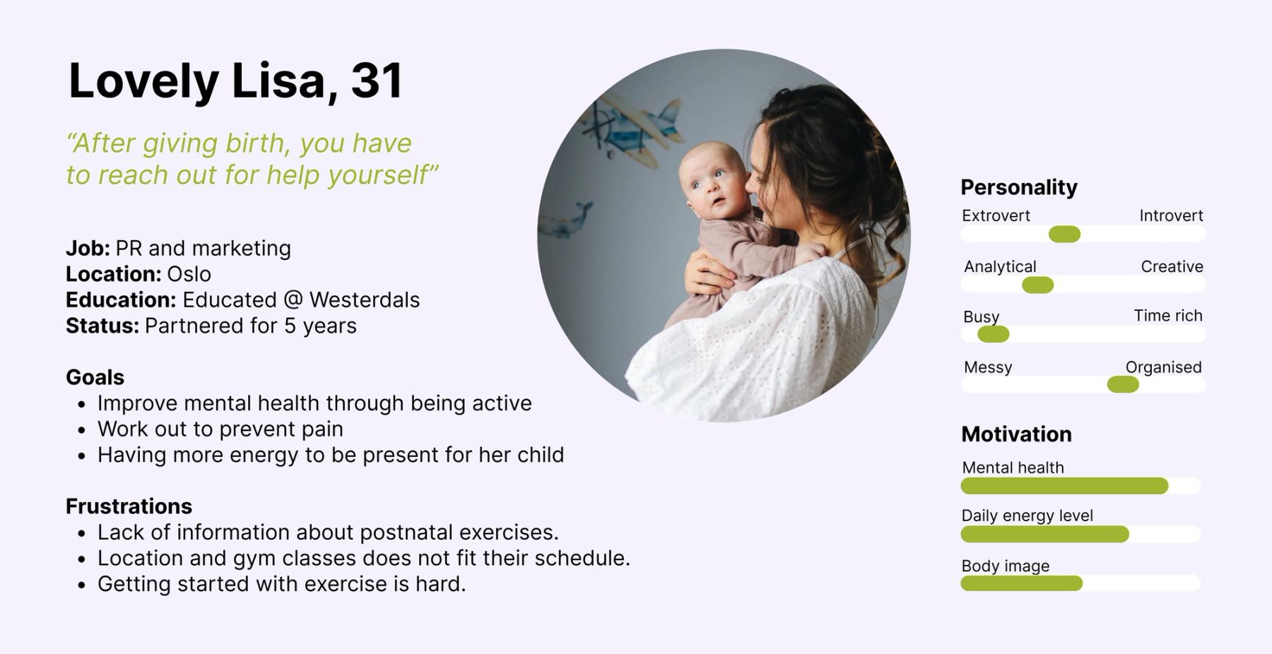
Based on the synthesized data, I created a primary persona named Lovely Lisa, representing the goals and frustrations of the target group. Using the persona, I developed user scenarios, user journeys, and a problem statement to gain a deeper understanding of the user's needs and challenges.
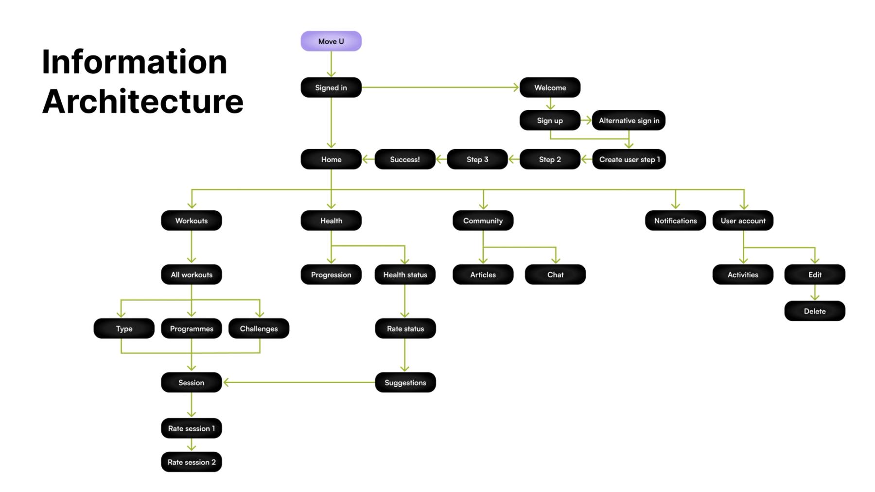
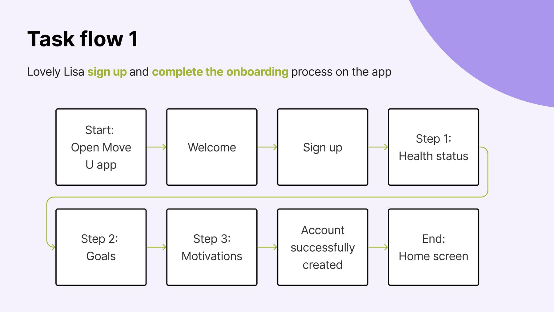
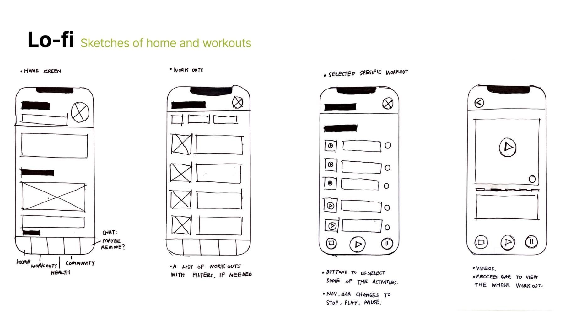
For the ideation process, I conducted workshops and used "How might we" questions to generate ideas for the app's interface. To ensure a seamless user experience, I created task flows, user flows, and information architecture, which helped me identify the necessary features for the app. Before starting the sketching phase, it was crucial to gather data and insights to help the design decisions.
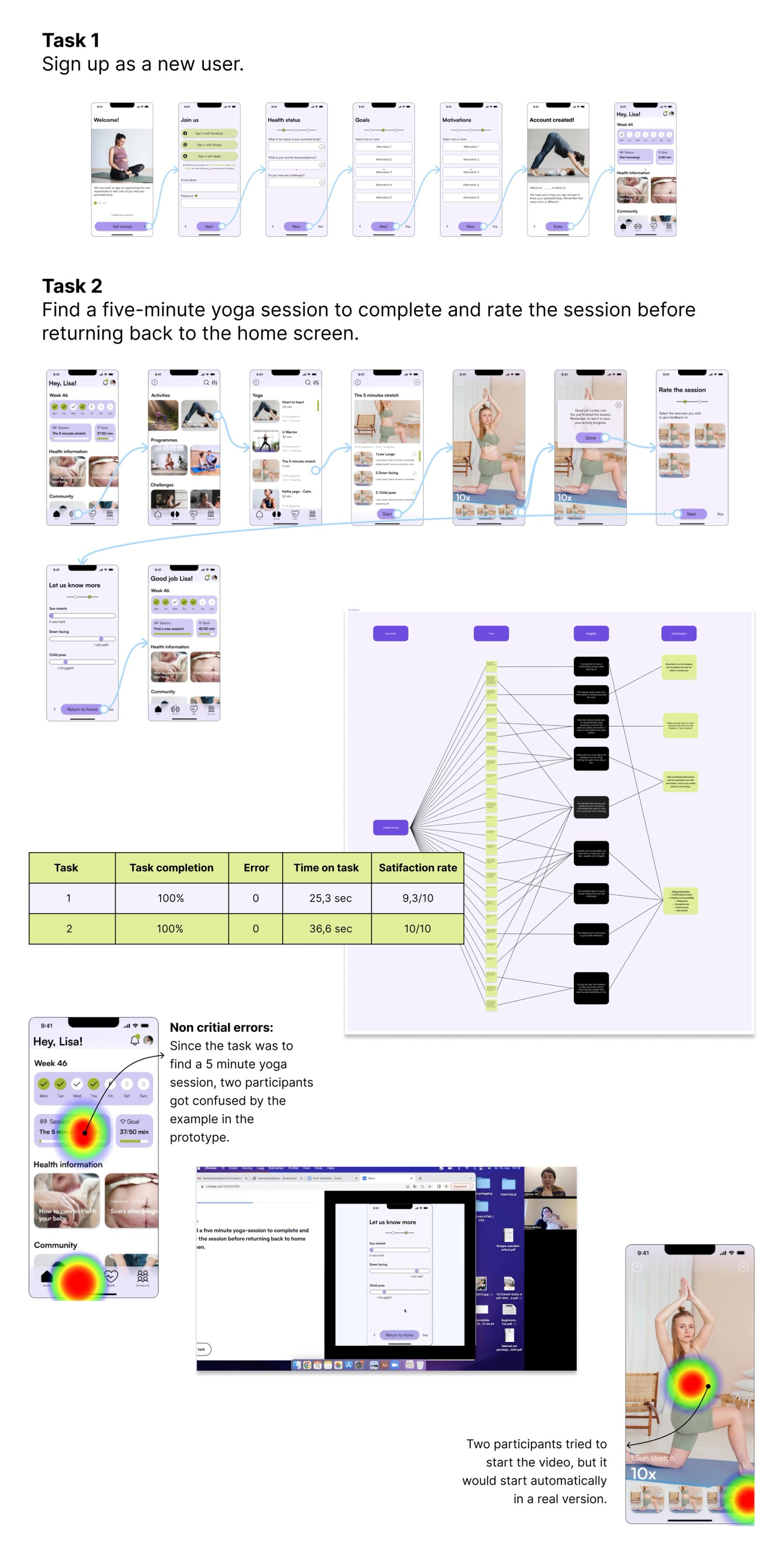
For the usability testing, I used Maze to create prototypes to perform remote and in-person tests. The main goal was to identify usability problems. By conducting the test I gained more insightful information about the app ́s interface and got valuable feedback from participants to make iterations on the product.
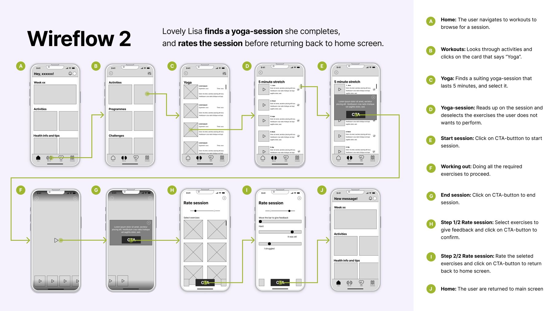
To align with my persona, Lovely Lisa, I recruited participants that matched in age, experience, and location for testing. Two specific tasks were given to provide metrics on the following KPIs:
- Task completion rate
- Error rate (Misclicks)
- Time on task
- Satisfaction rate
All data from Usability testing can be shared upon request.
Result:
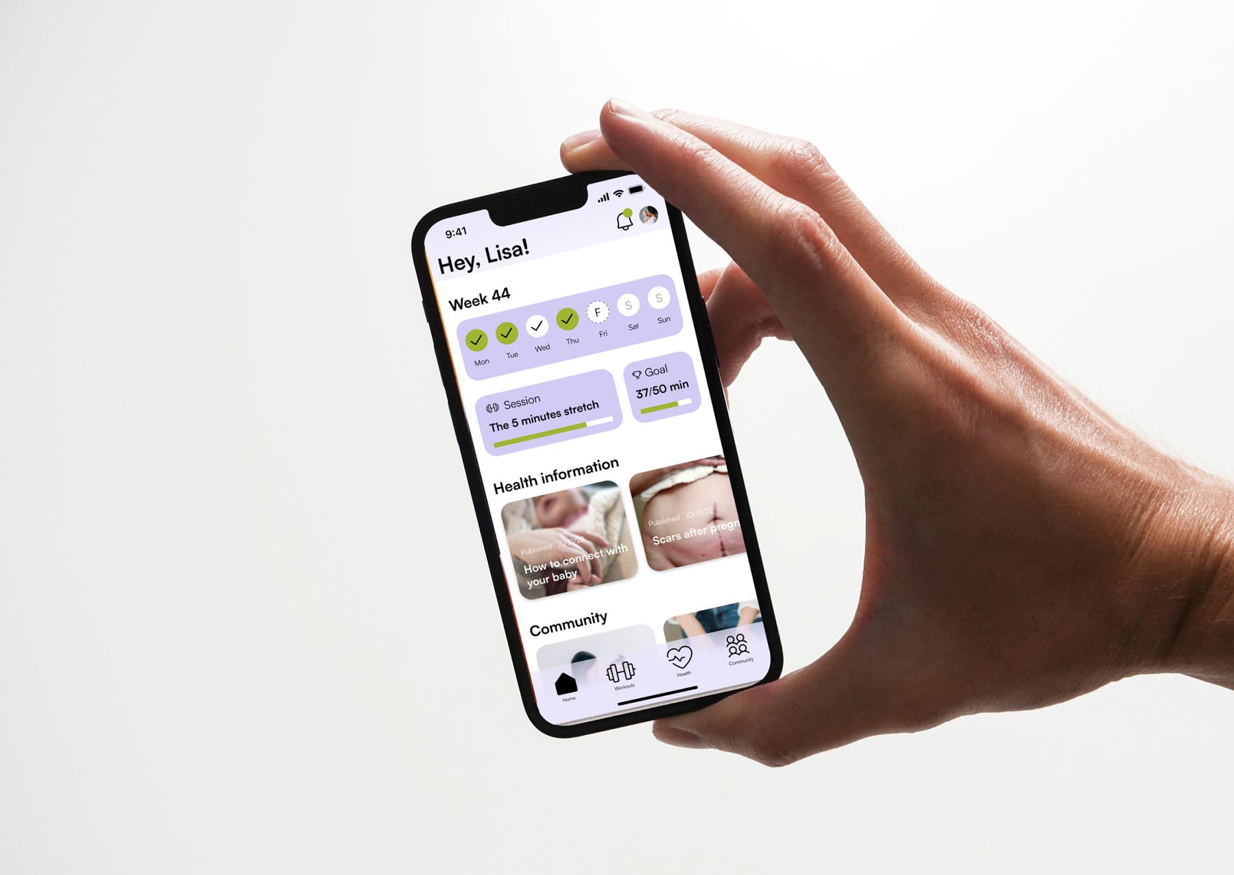
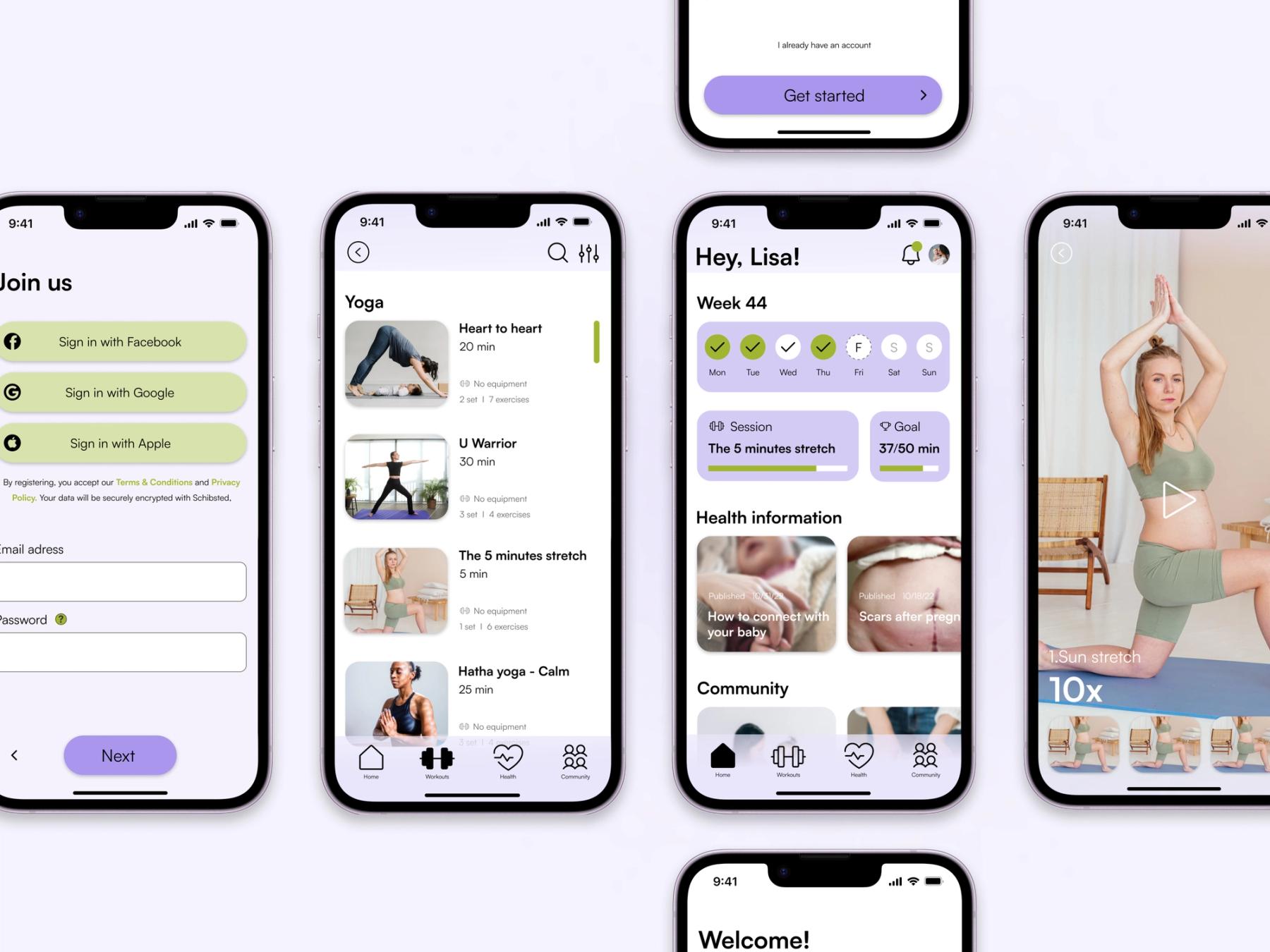
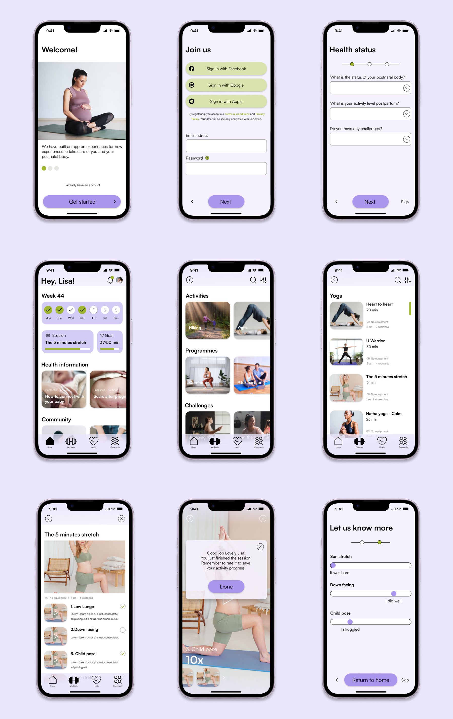
The Move U app provides postnatal individuals with personalized health programs that are convenient and tailored to their specific needs and schedules. From the copies to the graphics and overall user experience, every aspect of the app has been thoughtfully designed to support and assist new moms on their journey to regaining their fitness and overall health.
What I have learned:
During this project, I gained a deeper understanding of the importance of empathy towards the target group. As a male, I recognized the significance of taking the time to understand the unique needs and challenges faced by postnatal individuals. Designing an app specifically for this group was a rewarding experience, and it made me realize that if I were to create an app for a broader audience, including both men and women, the UI and UX would likely differ a lot.
